Your dentist website design isn’t just a digital business card—it’s your top salesperson. If it’s not bringing in high-value patients around the clock, something’s off. Dentists have turned low-traffic sites into growth engines just by fixing design. This guide explains what makes a dental website convert—from smart structure to sharp content. Ready to stop guessing and start scaling? Let’s break down what really works.
Key Takeaways:
- Clean, simple design with strong visual hierarchy improves conversions.
- Must-have website features include online booking, mobile-friendliness, fast loading, and visible contact details.
- Real team photos and clear, patient-friendly language build trust.
- Clear CTAs like “Book a visit” and “Call now” boost engagement.
- Custom dental websites outperform templates by reflecting brand identity and including key features.
- Good content structure includes a short intro, services, About page, contact info, blog, and reviews.
- SEO should focus on fast load speed, mobile readiness, SSL, original content, and local keywords.
- Accessibility matters: use alt text, readable fonts, and screen-reader compatibility.
- Leading 2025 dental sites use real visuals, minimal design, quick booking, and mobile-first layouts.
- HIPAA compliance needs secure forms and hosting; ADA compliance requires accessible design.

What Are the Key Elements of a High-Converting Dentist Website Design?
When visitors arrive, they click fast or leave even faster. A site’s layout must guide their eyes every step of the way.
How does design structure affect who calls or books?
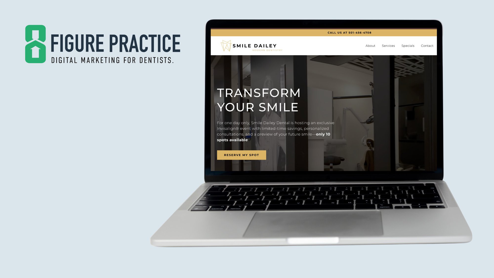
A clear layout with smooth flow makes it easier for people to take action. Sites like HelloTend or Grand Street Dental use spacing, color, and placement to maintain a clean, focused look. No clutter. Each section gets breathing room. Key actions like “Book Visit” and “Call Now” appear at the top and bottom.
Too many links or loud colors create confusion, which means fewer patients.
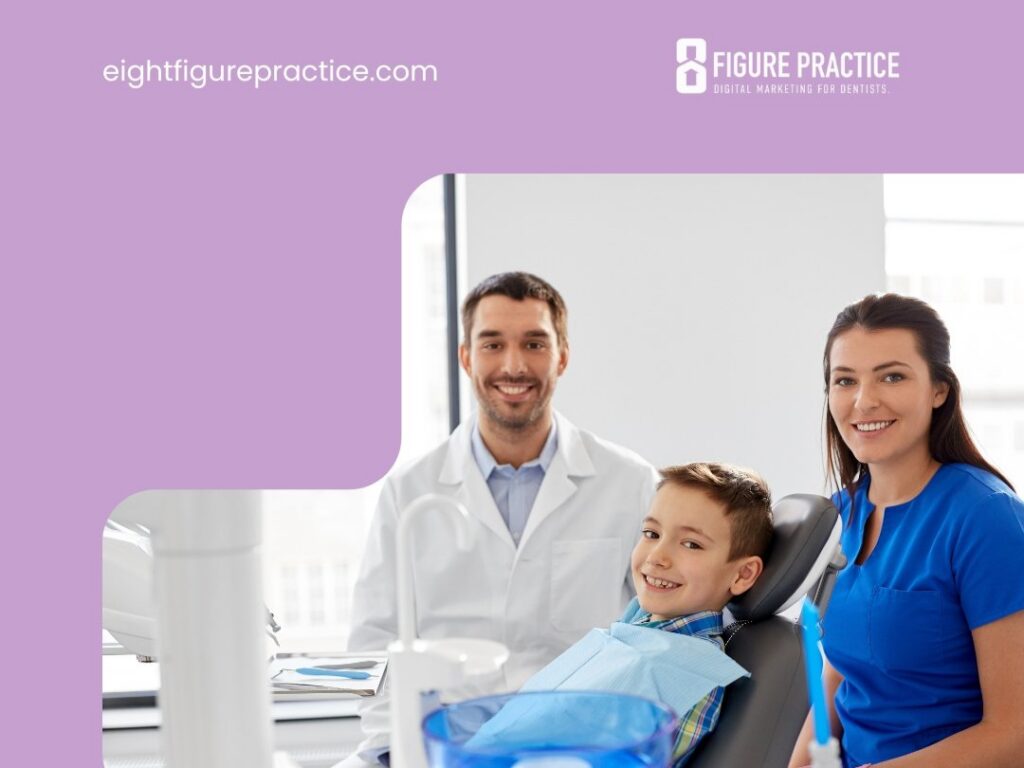
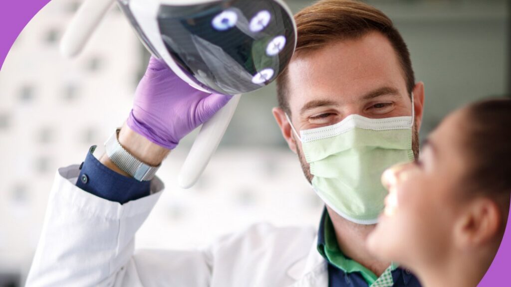
Organize the site into distinct sections. Use less text up top. Show large, friendly photos. Feature real doctors to build trust quickly.
Use one strong headline near the top—for example, “Gentle dental care in your neighborhood.”
Place the phone number in the top right corner. Add a “Book Online” button in the main navigation bar. These should stay visible on all pages.
What Kind of Content Makes People Book an Appointment?
Use direct, familiar language that speaks like a patient, not a textbook.
The homepage should answer: Who is this practice? What services are offered? Where is the office? How can someone book?
Recommended website content includes:
- A short welcome message
- Services offered
- Team photos
- Office hours
- Phone number and booking link
This content builds confidence.
A strong About page should tell a brief story—training background, core values, and what makes the care stand out. Include smiling photos of the team. Each service page should have short blocks: a title, a brief description, and a simple image or diagram if available.
What Are the Calls-to-Action That Really Convert?
Use short, clear phrases such as:
- “Book a visit”
- “Call our office”
- “Meet our team”
- “See our services”
Avoid overloading pages with buttons. Use one call-to-action per section. Make buttons large and easy to tap on mobile devices.
Add a form for quick questions with only essential fields: name, phone, and message. Long forms discourage use.
Sites like HelloTend keep it simple—one clear action per page, big buttons, and plenty of white space.
Active button text works best. Words like “Book” or “See” outperform “Submit” or “More info.”
Why Is Custom Dental Website Design Better Than Templates?
Dentists using pre-made templates often feel limited. Templates may look fine but rarely capture what makes a practice special. New patients want to trust the practice. Generic designs don’t help.
Templates limit messaging. They have set layouts, plain fonts, and stock colors. Many dental sites using templates share similar themes with no standout features.
Key elements may be missing—online booking, strong service pages, or mobile design. Fixing those later adds cost and hassle.
Templates offer short-term savings but often mean more work or a rebuild in the future.
Custom dental websites reflect who the practice is and how it operates. They:
- Speak to the ideal audience
- Support the service style—such as kids’ care or same-day crowns
- Match the office look, whether calm or lively
- Use real team photos instead of stock images
These details help build trust.
Custom sites usually cost more but bring greater return. Templates may be free or low-cost, but features are limited. Fixing issues later adds expense.
A custom dentist site saves time over months and years. It builds trust, attracts leads, and supports practice growth.
Think of it this way: would a stock image ever be used as a diagnostic tool? Of course not. Precise tools are needed for each patient. The website should work the same way.
Custom websites are an investment in patient relationships—not just a digital placeholder.
Which Features Should Every Modern Dental Website Design Include?
The top feature is online booking. Patients expect a “Book Now” button. If appointments can’t be made easily, visitors move on. One client saw a 40% spike in visits the month after adding online booking.
Next, add smart online forms. Printing forms at home is inconvenient. Online forms reduce front desk call volume.
Include a map and clear contact info on every page. Avoid tucking it only in the footer. Use a clickable map that opens directions with one tap.
Design must work on all devices—phone, tablet, or desktop—and load fast. Slow mobile sites lose patients quickly.
If unsure about mobile usability, test with someone over 60. If booking is difficult, the site needs improvement.
Live chat can answer quick questions about hours, insurance, or directions. This builds trust, as more patients prefer messaging to calling.
Use clear language and open space. Crowded designs or flashing images appear outdated. Calm design communicates professionalism.
Examples like Village Dental on Yosemite blend ease, speed, and helpful tools, guiding visitors step-by-step.
A modern dental website should allow users to:
- Book appointments online
- Fill out forms
- See office hours and address
- Use easily from any device
- Ask questions in real time via chat
What Makes a Dentist Website Design SEO-Ready?
Visibility online drives new patients. The following SEO fundamentals help search rankings:
Technical SEO:
- Fast load time with optimized images and solid hosting
- SSL certificate (“https”) for security and ranking benefits
- Mobile responsiveness for all screen sizes
On-Page SEO:
- Use search terms people actually type, like “emergency dentist” or “child dental care”
- Include keywords in page titles, headers, and image file names
- Focus each page on one clear topic
- Link related pages (e.g., cleaning page linking to contact page)
Local SEO:
- Verify and optimize Google Business Profile
- Ensure consistent name, address, and phone number across site and listings
- Add local keywords like “family dentist in Dallas” or “pediatric care near Queens”
- Use respected directories like Healthgrades or ZocDoc; avoid poor-reputation sites
For more, see guides on dental SEO marketing.
How Do Leading Dental Sites Optimize User Experience?
New patients need quick answers.
A well-structured dentist website design guides user focus. Big buttons, bold headlines, and white space direct attention. A bright “Book Now” button at the top encourages action.
Each homepage section should have a single purpose. Avoid cramming booking, services, and bios into one block.
Accessibility features help all visitors use the site. Large fonts, strong contrast, alt text for images, and screen-reader compatibility are essential. About 25% of adults live with a disability.
Use readability tools and accessibility checks to identify issues.
Mobile-friendly design is critical. Most visitors check sites on phones. A responsive design adapts layout for each screen. Tap targets must be large enough. Forms should be simple.
Testing on phones and desktops is essential—what looks fine on a laptop may be difficult on mobile.
Better user experience reduces no-shows and helps teams work smarter.
Clear info, breathing space, and accessible design create a welcoming experience.
What Are Examples of the Best Dental Websites in 2025?
Top dental website designs in 2025 share key features:
- Real photos on home pages
- Easy-to-read text
- Calm, professional colors like soft blues and whites
- One-click booking
Sites like Tend use large, authentic photos and simple text. Dntl Bar employs bold branding and clean scrolling, optimized for phones. Grand Street Dental offers warmth with cozy rooms, soft fonts, and real stories.
Common traits include avoiding stock images, soft design palettes, clear next steps, fast load speeds, and mobile optimization.
Big buttons, friendly photos, and smooth user flow set these sites apart.
For inspiration, review curated lists of best dental websites.
How Should Content Be Structured on a Dental Website Design?
Think of the site as a step-by-step guide for new patients.
- Homepage: Brand intro, phone number, booking button. This page builds trust.
- Services Page: List treatments with short descriptions, e.g., “cleanings,” “fillings,” “braces.” Avoid fluff. Include costs if possible.
- About Page: Photos of the team and brief bios showing care and training. Adds a human touch.
- Contact Page: Easy to find, with hours, phone, map, and short form.
- Blog: Dental tips, fears, tools. Keep posts brief and helpful. Tailor to families, teens, seniors with accessible language.
- Reviews: Show real patient testimonials with names to build trust.
- Team Bios: Short facts and smiling photos show kindness and expertise.
- Service Pages: One per treatment boosts SEO and educates patients. Write simply for newcomers.
Clear, helpful content turns visitors into booked appointments.
What Are the Latest Dentist Website Design Trends in 2024?
Three ideas define top dental sites: clarity, smart tools, and ease of use.
Why minimal design? Less stress for users. Open space, clean fonts, and focused colors make pages easier to read. Busy layouts repel visitors.
Blue and white remain favorites for calm professionalism. Some mix lighter or playful tones like peach.
Real photos replace stock images, building trust.
Common modern features:
- AI chatbots answer basic questions quickly
- Light animations and interactive menus guide attention subtly
- Online forms allow full booking on one screen
- Some sites use quizzes or light games to engage users, fitting the tone
These trends reflect patient behavior—most browse on phones and want control to book, read reviews, or ask questions easily.
Real bios and stories show understanding of patient fears with care and calm dentist website design.
Sites are more than pretty—they’re useful, fast, and trusted.
Which Platforms and Tools Are Best for Building Dental Websites?
Wix: Fast, simple drag-and-drop with booking, forms, and search tools. Less flexible and may have higher costs for key features.
WordPress: Full control with many dental themes and plugins for booking and chat. Setup can be complex, requiring expert support.
Proprietary builders: Dental agencies offer all-in-one design, hosting, booking, and forms. Usually cost more and require contracts.
Choosing the right platform:
- WordPress fits those wanting control and able to manage updates
- Firms or agencies suit those needing hands-off setup and support, with plans to expand or advertise
Look for platforms supporting forms, calendars, and emails. Forms must be secure. Booking should be streamlined. Email integration is helpful.
Most clients prioritize:
- Quick booking
- Simple forms
- Team pages
- Search visibility
The tool doesn’t have to be fancy, just effective for patient service.
How Can Dentists Ensure Compliance and Security on Their Site?
Protecting patient data is essential.
HIPAA compliance requires:
- Securing health data with proper tools and safe systems
- End-to-end encryption for forms and messages
- SSL certificates (“https”)
- Hosting with a Business Associate Agreement (BAA)
- Data stored on U.S. servers
- No emailing of full health info; use secure messaging or patient portals
ADA compliance requires:
- Clear text
- Alt tags for images
- High-contrast colors
- Avoiding blinking or dense menus
- Regular checks with tools like WAVE
These improvements help accessibility and boost SEO.
Security measures:
- Use hosts with backups and regular updates
- Block common attacks
- Use SSL
- Update software weekly
- Avoid outdated plugins
- Enable two-factor authentication
- Never send passwords via email
- Use secure healthcare forms
Payment processing must comply with PCI standards. Stripe and Square are examples.
Visitors leave sites that feel risky and stay when they feel safe and included. Security and access are foundational to keeping visitors engaged.
Good dentist website design attracts visitors. Security and accessibility keep them coming back.
Ready To Grow Your Dental Practice?
Looking to attract more patients, build trust through a standout website, and scale your practice faster? Eight Figure Practice delivers proven strategies—from custom dental website design to SEO and paid ads—that turn visitors into loyal patients. Schedule a strategy session today and discover how expert execution transforms your online presence into a powerful growth engine.